Hi! I'd like to wisely introduce you my new online resume. I worked hard to reach this level of quality so I'm kinda proud of it.
Features
- HTML5 + CSS3
- Spritted CSS images
- Smooth scrolling using jQuery
- Full responsive layout (from 320x240 to... whatever!)
- Mobile version (goes with responsive layout)
- Supports IE7+
- 98/100 on Google Page Speed
- A Grade on YSlow
- HTTP caching + compression
- Twitter Bootstrap
- Semantic HTML5 design
- RDF/XML + Dublin Core metadata
It took some time for me to realize it because I'm not a designer and I didn't know what I really wanted... Wanted something very neat, simple but also with a touch of "handiwork" because I wanted it to reflect my way of coding. Clear, neat, easy and full featured with handy tools.
The PDF resume is now generated with LaTeX (I found a great template) and it's as clear as the online version but without jobs details...
What do you think of it? Write me your feels about it...
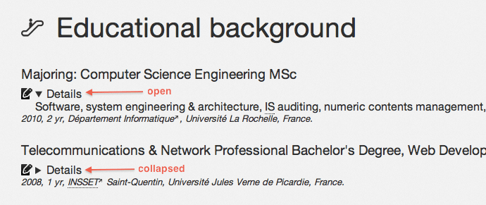
Semantic design
For best semantic usage, I tried to use the most sens maker HTML tags like section, header, footer, aside, details and of course, good usage of definition list (dl). What is fun is that the details element isn't implemented yet on Web browser except Google Chrome. Check this out :
Caching and compression
They are really important for your page content, let's see how to cache and compress your data.
Client side
The aim isn't only to minimize the data content but also to aggregate when possible. For pictures, use CSS sprites if the pictures have a design scope. Of course, you couldn't sprite any CSS pictures since some of them have too different background-position (like the external arrow after my links).
Use sprite tools like SpriteMe or desktop tools like Compass.
If you don't use Compass which compresses your CSS output, you can use YUI Compressor (which also works for JavaScript compression). About JavaScript, don't forget that loading a JavaScript file stops parallels content loading! All content files (pictures, CSS, whatever else) could be loaded in the same time (depending on the server pipeline capabilities) but when it's about JavaScript, the server can't provide other resources until the JavaScript file is fully loaded.
To avoid cascading loadings, aggregate your files in one. For example, for my Website, I used a small scripts to aggregate and compress my resources files :
#!/bin/sh
cat js/jquery-min.js > js/scripts.js
cat js/jquery.scrollto-min.js >> js/scripts.js
cat js/jquery.localscroll-min.js >> js/scripts.js
cat js/ui.js >> js/scripts.js
java -jar yuicompressor-2.4.7.jar --type js -o ../ui/js/scripts-min.js js/scripts.js
It's THAT easy to make your resourses file really optimized. Do the same for your CSS files.
Server side
Read or listened to everywhere, use compression and right headers from your Web server! Even in shared hosting, mod_deflate and mod_expires are commonly available. First of all, add specific headers to your page :
<?php
$expiration = 3600 * 24 * 15; // 15 days for example
date_default_timezone_set('Europe/Paris');
header(sprintf('Expires: %d', date('r', time() + $expiration)));
header('Last-Modified: ' . date('r', getlastmod()));
header(sprintf('Cache-Control: max-age=%d, s-maxage=%d, must-revalidate, proxy-revalidate', $expiration, $expiration));
header('Pragma: public');
header('Content-Type: text/html;charset=UTF-8'); // avoids the http-equiv meta tag
After that, make a .htaccess file and write down this :
# Disallows www. subdomain
RewriteEngine On
RewriteBase /
RewriteCond %{HTTP_HOST} !^(http://)?joris\.me [NC]
RewriteRule (.*) http://joris.me/$1 [R=301,L]

# Enables file expiration
ExpiresActive On
ExpiresDefault "access plus 7 days"

# Enables compression
SetOutputFilter DEFLATE
BrowserMatch ^Mozilla/4 gzip-only-text/html
BrowserMatch ^Mozilla/4\.0[678] no-gzip
BrowserMatch \bMSIE !no-gzip !gzip-only-text/html
SetEnvIfNoCase Request_URI \
\.(?:gif|jpe?g|png)$ no-gzip dont-vary
Header append Vary User-Agent env=!dont-vary
Note : read Apache mod_deflate manual and mod_expires manual for explanations.
Design responsiveness
Overuse media queries! I managed to make a very flexible layout for your devices. Depending on your screen resolution, you may have different versions of the layout, more or less airy. Here are some screenshots I made with my Firefox 8 using different windows sizes :
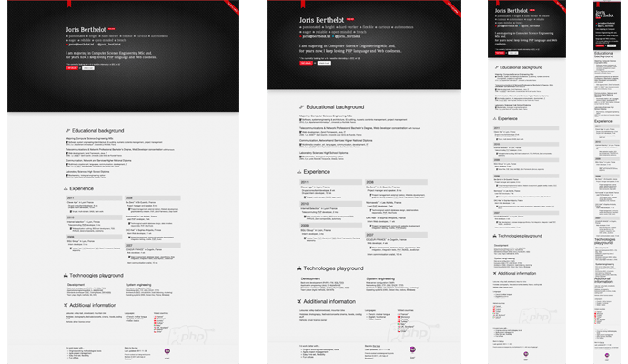
Since I haven't any tablets or touch screen smart-phone, I couldn't test the responsiveness of these kind of devices but I guess it's fine. On small smart-phone screen like my BlackBerry one, the layout is good :

Here are some examples of code I used :
@media (max-height: 600px) {
    #start {
        height: auto;
    }

    #start header {
        margin-top: 2%;
        padding-bottom: 2em;
    }
}

@media (min-height: 600px) and (max-height: 900px) {
    #start header {
        margin-top: 4%;
        padding-bottom: 2em;
    }
}
For more information, check out the W3C recommendation and have a stop on Mediaqueri.es.
It was a real pleasure for me to re-develop my resume. It's been time I didn't face IE integration problems and now, I remember why I'm a full back-end developer and not a Web integrator. I hope this article will give you some good advices about what are nowadays Websites are excepted to react with technologies.
The code source of my resume is available on my Github!