Meanwhile I'm finishing my photography portfolio, I was wondering how could I test my design responsiveness as my screen resolution is 1440x900 max so I figured out a work around...
For low resolutions, it's quite easy because you only have to resize your browser window or use Web Developer extension which provides some predefined common window sizes.
But what about 1600x1200 resolution when your laptop screen is 1440x900 (for my example)?
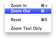
You could either use tool like Responsive Design Testing by Matt Kersley OR, you could use your native browser functionality if your design is well done. I mean if you built your design using em instead of px, that should work pretty well.

Absolutely!
Just give a try...
Enjoy!